I've never been a fan of change. It scares me to death. Sure, I can look back over my life and see so much good that has come from change, so much growth...but when faced with that moment right before the change...I'm terrified.
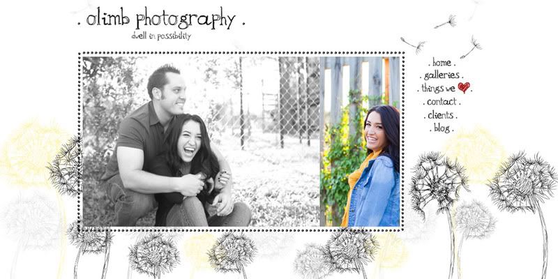
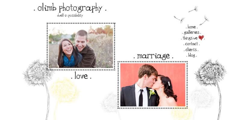
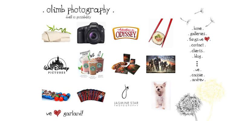
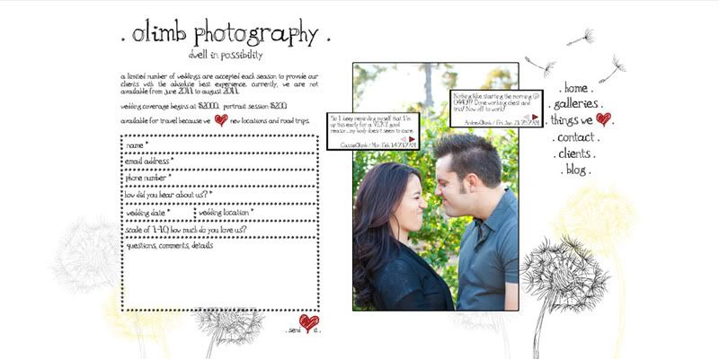
I havent been satisfied with my website for quite some time. It was a fine website, but I wanted more. I wanted something that was about Andrew and I and who we are as people, not just about the photos. But I was scared to make a change because so many people ere on the side of "dont change your image too much or you wont be recognized". But we're people...not just photographers and people change on a daily basis. And our website needs to reflect who we are, not who we were. So, the time came for a change...a brand new website and blog compliments of an amazing couple of months developing with Spilled Milk Designs through ShowIt. And I seriously have to give an extra shout out to Rachael for her amazing design work and putting up with me and all my changes.
So head on over to our website, take a look around and let us know what you think! And our blog...well, I say our blog but really, it's MY blog. Andrew gives me free reign there...it's my outlet and it's really for me personally to have that place where I can really share who I am and how I see life. I'll have a new blog coming up a little later this week. But until then, enjoy the warm and gooey goodness that is our new website! Leave us some love and let us know what you think!
Brand spankin NEWNESS: www.olimbphotography.com
Dwell in Possibility...
Cassie
Subscribe to:
Post Comments (Atom)


I like it a lot! A bit quirky, nothing generic about it...which you know is bound to appeal to the likes of me. ;)
ReplyDeleteLoved the new website. It is fun and really gives a picture of who you are as a couple and individually. I think it will be helpful drawing in clients because they can get a feel for your personalities so it isn't as mysterious. The only thing I would critique is your galleries section. When you click on that section, you have the pictures that are scrolling by which is fun, but it might not be best for couples that are looking for what a different variety of pictures and poses you can take. You might want to have the pictures that are scrolling in some little thumbnails or something that is more accessible. It would be easier for people looking in to be able to see all the different poses and backgrounds instead of waiting for each picture to scroll by.
ReplyDeleteOther than that little note, I think everything looks great. It is creative and easy to navigate. I love it!